Layout is the backbone of every modern web application. Whether you’re building a dashboard, e-commerce storefront, or a simple blog, how you structure elements on the page dramatically impacts usability and performance. With Tailwind CSS, you gain a powerful, utility-first toolkit for controlling layout without writing custom CSS from scratch.
Two of the most important layout techniques in modern frontend development are flexbox and grid. Tailwind abstracts the complexity of these CSS standards into clear, composable utility classes. The result is code that’s easier to read, easier to maintain, and highly responsive across devices.
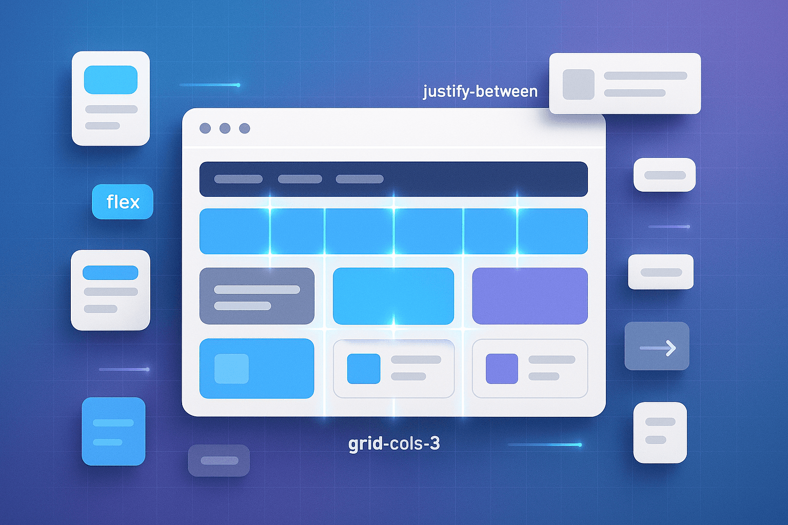
Why Grid and Flexbox Matter
Before diving into Tailwind’s syntax, let’s understand the “why.” For years, web developers struggled with floats, tables, and clearfix hacks to achieve layout. Then came flexbox and grid:
- Flexbox excels at one-dimensional layouts. It’s perfect when you want to align items along a row or column.
- CSS Grid shines in two-dimensional layouts. It allows you to define rows, columns, and precise placement of elements.
Together, they cover nearly every layout scenario. And with Tailwind, you don’t need to memorize complex CSS syntax—you simply apply the right utilities.
The Tailwind Approach
Tailwind transforms verbose CSS rules into short, atomic classes. Instead of writing:
display: flex;
justify-content: space-between;
align-items: center;
…you simply write:
flex justify-between items-center
This brevity is not just convenient—it enforces consistency across your codebase, reduces cognitive load, and speeds up development.
When to Use Flex vs Grid
The biggest question developers face is knowing when to reach forflex versus grid. Here’s a practical guideline:
- Use Flexbox when alignment matters more than structure—navigation bars, horizontal button groups, vertical centering.
- Use Grid when structure matters more than alignment —dashboards, galleries, complex landing page layouts.
- Don’t be afraid to combine both. A grid for the outer structure and flexbox for internal alignment is a common pattern.
Practical Examples
1. Responsive Navbar with Flexbox
A navigation bar typically aligns items horizontally with space between them. Tailwind makes this trivial:
<nav class="flex justify-between items-center p-4 bg-gray-800 text-white">
  <div class="font-bold">Brand</div>
  <ul class="flex space-x-4">
    <li>Home</li>
    <li>About</li>
    <li>Contact</li>
  </ul>
</nav>
2. Dashboard Layout with Grid
Dashboards often need sidebars and content areas. CSS Grid makes this effortless:
<div class="grid grid-cols-4 gap-4 h-screen">
  <aside class="col-span-1 bg-gray-200 p-4">Sidebar</aside>
  <main class="col-span-3 bg-white p-4">Main Content</main>
</div>
3. Product Card with Flex and Grid
Cards often need both—grid for the outer layout and flexbox for internal alignment:
<div class="grid grid-cols-2 gap-6 p-6 border rounded-lg">
  <img src="/product.jpg" alt="Product" class="rounded-lg"/>
  <div class="flex flex-col justify-between">
    <h2 class="text-xl font-semibold">Product Name</h2>
    <p class="text-gray-600">Description goes here...</p>
    <button class="bg-blue-600 text-white px-4 py-2 rounded">Buy Now</button>
  </div>
</div>
Best Practices
- Keep it simple: Start with basic utilities before layering on complexity.
- Use responsive prefixes:
sm:grid-cols-2 md:grid-cols-3 lg:grid-cols-4scales your layout gracefully. - Combine wisely: Flexbox inside grid cells keeps internal alignment tidy.
- Leverage gap utilities: Tailwind’s
gap-xandgap-yeliminate the need for manual margins.
Common Pitfalls
- Over-engineering: Don’t add unnecessary wrappers.
- Forgetting mobile-first: Always test on small screens first. Tailwind is mobile-first by design.
- Neglecting semantics: Tailwind handles styling, but use semantic HTML for accessibility and SEO.
Real-World Use Cases
Some of the biggest tech companies use Tailwind with grid and flexbox to power their UI. Here are common patterns:
- E-commerce grids for product listings
- Content-heavy blogs with flexible sidebars
- Interactive dashboards with responsive charts
- Marketing landing pages with mixed layouts
Performance Considerations
Tailwind’s JIT (Just-In-Time) engine ensures you only ship the CSS you use. Even complex grid and flex combinations won’t bloat your bundle.
Additionally, utility-first classes reduce custom CSS files, which can simplify long-term maintenance and caching strategies.
Final Thoughts
Mastering Tailwind’s grid and flex utilities isn’t about memorizing classes—it’s about understanding when and how to apply them. Once you internalize the difference between one-dimensional (flexbox) and two-dimensional (grid) layouts, you’ll find yourself building responsive designs in a fraction of the time it used to take.
As projects scale, these patterns become invaluable. They provide predictable structure, reduce bugs, and keep your team aligned. If you haven’t already embraced Tailwind’s approach to layout, now’s the time to experiment. Start small, practice with real-world examples, and soon you’ll be creating production-ready designs with confidence.